
A book exchange platform: product & systems audit
- Type
- Client work
- When
- 2026
- My role
- Product, UX & systems audit
- Platform
- Web · Mobile & desktop
The client's name and site are kept private. The diagrams are illustrative and show no client data.
The situation
The owner of a book exchange platform was preparing to promote the service to a wider audience and wanted an independent view of whether the product was ready for more users.
The platform connects online book discovery with real-world exchanges, so the review needed to look beyond individual screens. I looked at whether a new visitor could understand the idea, find a book, choose a location, arrange an exchange and feel confident enough to come back.
I also reviewed the wider system for issues that could become more important as usage increased.
My role
I carried out a product, UX and systems readiness audit across desktop and mobile.
I used the service as a new visitor would, tested its main journeys and looked for points where people could become confused, get stuck or lose confidence.
Alongside the user experience, I reviewed areas such as authentication, privacy and data handling, technical behaviour and potential scaling risks.
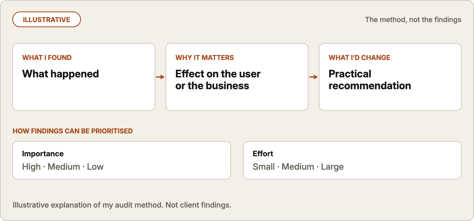
I then turned the findings into practical recommendations, prioritised by their importance and the effort involved in fixing them.
What I did
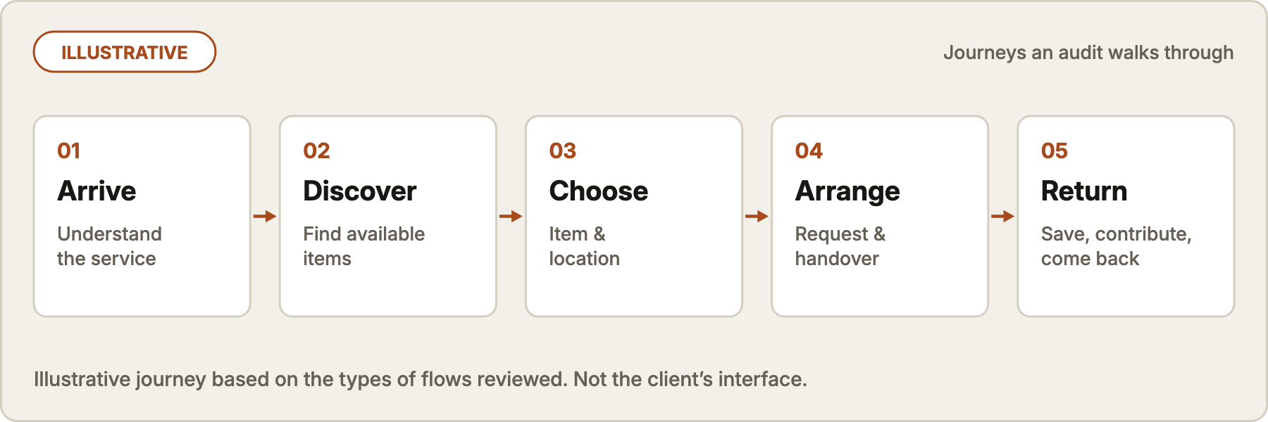
1. Followed the real user journeys.
I worked through the service on desktop and mobile rather than reviewing screens in isolation.
This included understanding the service as a new visitor, exploring available books, choosing locations, requesting and saving books, following the exchange process, adding a book, creating an account and using supporting features.
That exposed problems that were easy to miss when looking at individual pages – particularly where an action changed something elsewhere on a mobile screen, or where moving between parts of the service lost useful context.
2. Looked at the whole product, not just the interface.
Some of the most important findings were about how different parts of the service worked together.
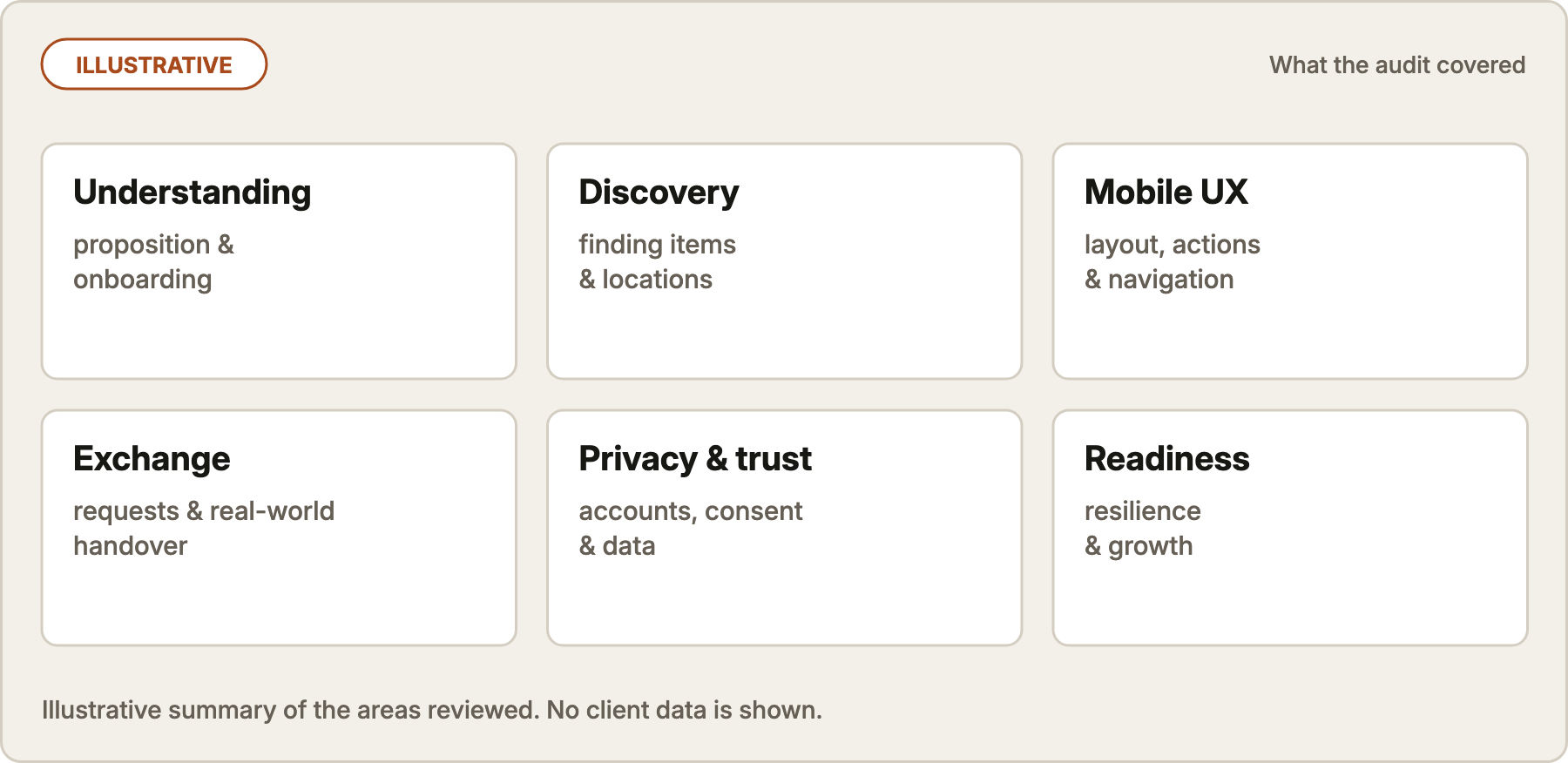
I looked at whether terminology stayed consistent, whether people understood when they were trying a simulated experience or using the real service, how the digital experience related to physical books and locations, and what happened when information or availability could not be guaranteed.
I also identified things that already worked well and should be preserved rather than redesigned.
3. Reviewed systems and readiness for growth.
The audit also looked beyond UX.
I reviewed the parts of the system that could be assessed responsibly from the product and its public behaviour, including account access, privacy and consent, browser storage and visitor tracking, data handling, physical book availability and potential scaling issues.
Where something could not be verified without access to internal systems, I said so rather than treating an assumption as a finding.
4. Turned the findings into priorities.
Each confirmed issue was documented with what I found, why it mattered and what I recommended changing.
The aim wasn't to produce the longest possible list of problems. It was to distinguish between things worth fixing before bringing more people to the service, improvements that should follow soon afterwards, and smaller changes that could wait.
What happened next
The client received a complete Product/UX and Technical Readiness Audit covering desktop and mobile, with practical recommendations that could be taken into the next round of development.
The review identified a focused set of improvements to make before significantly increasing promotion, while also showing that the underlying product idea and much of the existing experience were worth building on.