
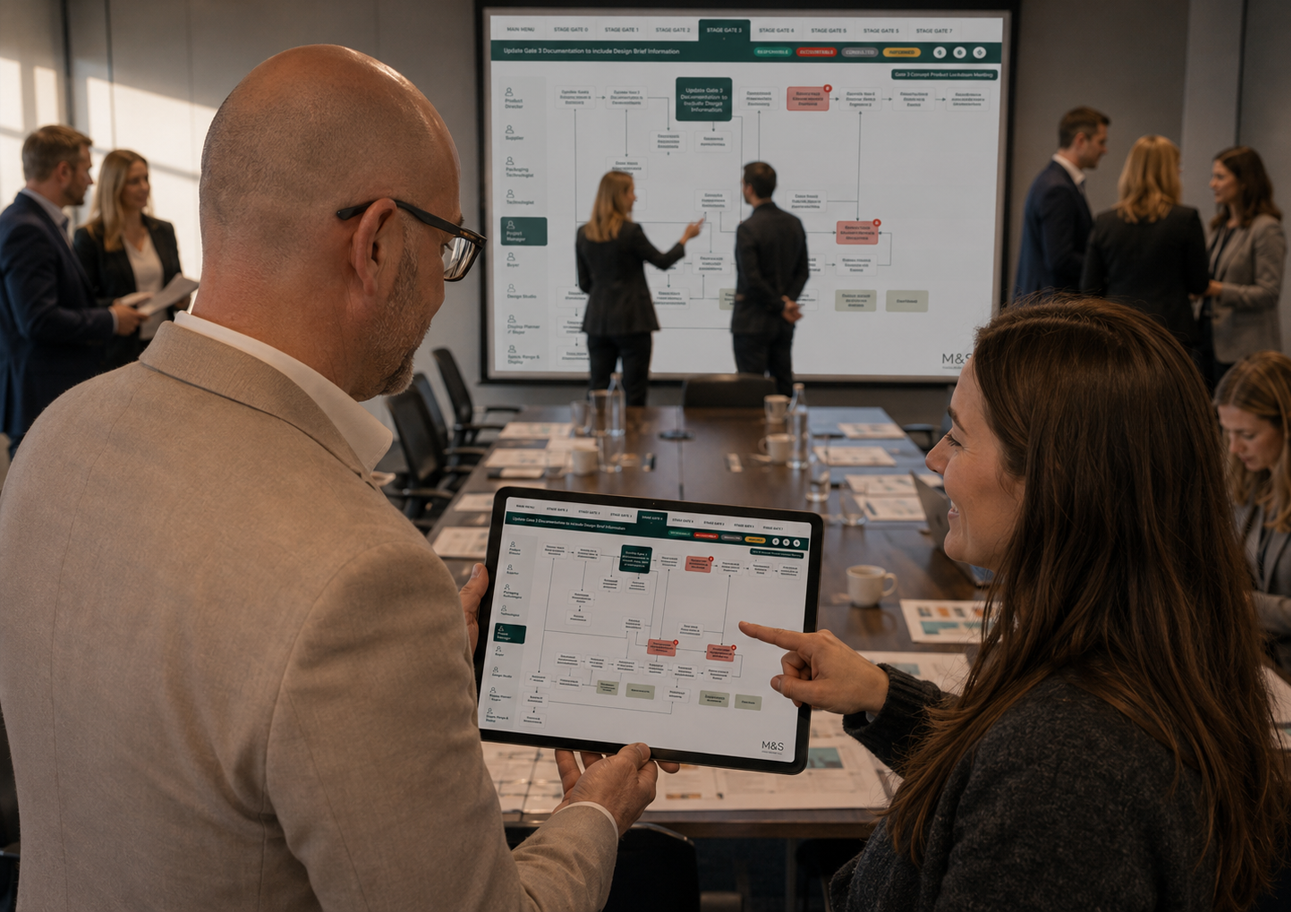
Helping thousands of people make one better decision
A unified supply chain platform that brought fragmented forecasting, planning and collaboration into a single source of truth.
Case study overview
The challenge
Replace fragmented forecasting, planning and supplier processes with a shared view of the complete product journey.
The outcome
A unified supply chain platform that helped more than 100 suppliers and internal teams understand the same journey, clarify ownership and make better-informed decisions.
My role
Product discovery, stakeholder workshops, systems thinking, UX design, prototyping and close collaboration with engineering.
Key areas
Enterprise UX, Systems Design, Supply Chain, Internal Tools
I wasn't trying to redesign forecasting. I was trying to help people see the same picture.
When I first joined the project, everyone understood their own part of the supply chain.
That wasn't the problem.
The difficulty was that nobody could see the whole journey.
Forecasts lived in one system. Documents lived somewhere else. Suppliers were often working from different information to internal teams, while events like Wimbledon, Easter and changing weather could dramatically alter demand without ever becoming part of the planning process.
The organisation had grown around separate teams doing good work independently.
What it lacked was a shared understanding of how all those decisions connected together.
The opportunity wasn't simply to replace an ageing application.
It was to build something that made the entire product journey visible.
When everyone understands the same journey, better decisions happen naturally.02 // Evolution
The project became much bigger than replacing a legacy tool.
The original brief focused on modernising an existing forecasting application.
Discovery quickly showed that rebuilding the same product with a newer interface wouldn't solve the underlying problem.
Forecasting was only one small part of a much larger ecosystem involving buyers, category managers, suppliers, manufacturers, logistics teams and technical specialists.
Instead of redesigning individual screens, we redesigned how information moved through the organisation.
The platform became a shared view of the entire product lifecycle rather than another isolated business application.
Before
Legacy forecasting software focused on individual tasks, disconnected documents and fragmented ownership.
After
A shared platform that helped more than one hundred suppliers and internal teams understand the same journey together.
The interface wasn't designed around data. It was designed around confidence.
Show the whole journey
Rather than asking users to jump between systems, the platform visualised the complete journey from concept to shelf so every stakeholder understood where they were and what came next.
Clarify ownership
Introducing RACI throughout the interface made responsibility visible rather than implied. Bottlenecks became much easier to identify because ownership was no longer hidden inside meetings or documents.
Bring context into forecasting
Demand is shaped by real life. Wimbledon, Easter, weather and bank holidays became part of the forecasting experience instead of relying on planners remembering them separately.
Design for adoption
The platform needed to work equally well for experienced planners, occasional users and external suppliers using older hardware. Simplicity wasn't a visual choice. It was essential for adoption.
This project changed how I think about complex systems.
Before M&S, I assumed enterprise software became difficult because organisations were complicated.
After M&S, I realised something much simpler.
Most complexity comes from people being unable to see how their work connects to everyone else's.
That lesson has followed me into every project since.
Whether I'm designing an enterprise supply chain platform or building QuietStrength on my own, the goal is remarkably similar.
Help people understand what matters.
Remove everything that doesn't.
Then let the product quietly explain itself.