
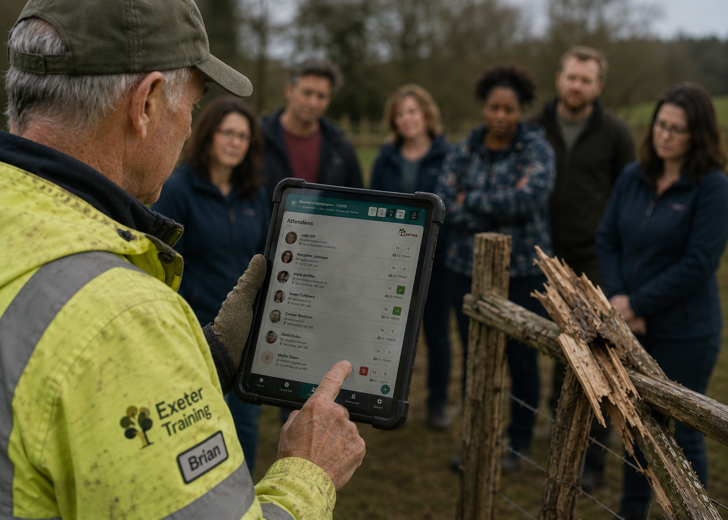
When good design becomes a safety feature
An offline-first assessment system designed for instructors working in forests, farms and remote environments where reliability mattered more than aesthetics.
Case study overview
The challenge
Design an assessment system instructors could rely on outdoors in forests, farms and remote environments where signal, weather, lighting and gloves affected every interaction.
The outcome
A touch-first, offline-first assessment platform designed around real working conditions rather than office assumptions, reducing processing from weeks to the same day.
My role
Discovery, workflow design, prototyping, interaction design, frontend collaboration, accessibility and reusable product patterns.
Key areas
Mobile UX, Offline First, Accessibility, Process Design
I realised very quickly that this wasn't a design problem. It was a reality problem.
The first designs I was shown looked beautiful.
They'd been produced as large A3 Photoshop files with tiny text, intricate layouts and almost no consideration for the devices instructors actually carried into the field.
Then I thought about where these people were using them.
Standing in woodland.
Working in bright sunlight.
Sometimes in heavy rain.
Often wearing gloves.
Usually with little or no mobile signal.
Nobody was sitting behind a desk admiring beautifully crafted layouts. They were trying to assess learners safely while standing outdoors.
That changed how I thought about the project.
The goal wasn't to make the app look better.
It was to make it disappear into the background so instructors could focus on the people in front of them rather than the technology in their hands.
Good design isn't what looks best in the studio. It's what still works when you're standing in a muddy field wearing gloves.02 // Evolution
The project moved from digitising paperwork to designing for the real world.
The original thinking focused on replacing paper forms with a digital alternative.
Once we started working with instructors, it became obvious that simply recreating paper on a screen wouldn't be enough.
The app needed to survive poor signal, changing weather, bright sunlight and long working days without becoming another thing instructors had to think about.
That meant stripping away unnecessary complexity and designing around the realities of the environment rather than around the office.
The result wasn't simply a tablet application.
It became a resilient offline-first assessment platform that instructors could genuinely trust.
Before
A paper-based assessment process supported by an unusable tablet concept built from large Photoshop mock-ups that couldn't realistically be used outdoors.
After
A touch-first, offline assessment platform that reduced processing from weeks to the same day while becoming the foundation for the wider learner, instructor and provider ecosystem.
Every decision started with the environment, not the interface.
Design for conditions, not screens
Every interaction was designed around the reality of outdoor assessments. Large touch targets, strong contrast and simple layouts meant instructors could continue working regardless of weather, lighting or gloves.
Offline by default
Connectivity couldn't be assumed, so the experience was built to work without a signal. Data remained available throughout the assessment before synchronising automatically when a connection returned.
Prototype in the field
Rather than relying on meeting rooms, prototypes were tested alongside instructors during real assessments. Feedback came from actual use rather than assumptions.
Think beyond one application
The instructor app became the foundation for a much larger ecosystem. Design patterns, components and interaction standards were deliberately created so learner, instructor and provider portals could grow from the same foundation.
Design, development and product thinking happened together.
I discarded the original Photoshop handover almost immediately and rebuilt the product through interactive Figma prototypes that could switch between low and high fidelity depending on the conversation we needed to have. Stakeholders could discuss workflows without being distracted by visual design, then move seamlessly into polished prototypes when required.
Working closely with the engineering team, I developed components directly alongside implementation, resolving edge cases while the product was being built rather than documenting them for someone else to solve later.
At the same time I introduced reusable interaction patterns, accessibility standards and frontend components that became the starting point for future Redox products rather than existing only inside this project.
05 // ReflectionThis project changed how I think about context.
Before Lantra, I tended to think about interfaces first.
After Lantra, I thought about environments.
A screen doesn't exist in isolation.
Sometimes it's used in an office.
Sometimes it's used in bright sunshine.
Sometimes it's being held with muddy gloves while somebody is responsible for another person's safety.
Good products begin by understanding those moments.
That lesson has stayed with me ever since.
Whether I'm designing enterprise software or building QuietStrength, I always try to understand where the product actually lives before deciding what it should look like.