
Building a calmer kind of wellness app
A native iOS ecosystem built around Body, Mind and Ground that helps people notice patterns rather than chase perfection.
Case study overview
The challenge
Create a calmer, more private wellbeing experience that helped people notice meaningful patterns without pressure, subscriptions or unnecessary complexity.
The outcome
A native iOS product built and launched from scratch, evolving through real-world use into three connected pillars: Body, Mind and Ground.
My role
Independent product strategy, discovery, UX and interaction design, branding, SwiftUI development, testing and App Store release.
Key areas
Product Strategy, iOS, Privacy, AI-assisted Development
QuietStrength didn't start as a wellbeing app.
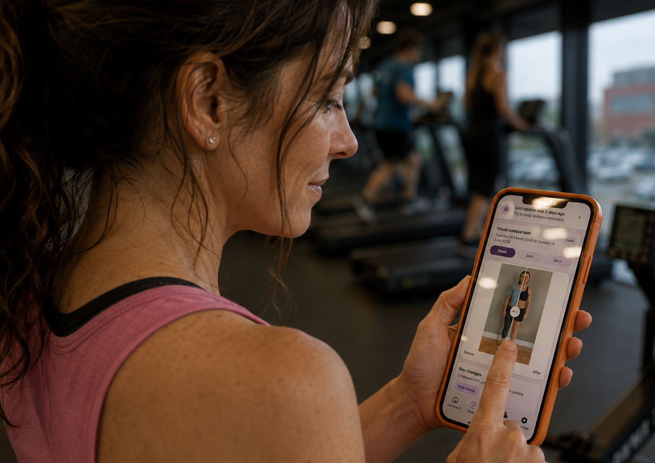
QuietStrength began because I wanted somewhere to keep weekly progress photos.
I'd recently been made redundant and was trying to look after myself a little better. Nothing dramatic. I wasn't chasing some huge transformation or trying to reinvent my life. I simply wanted to know whether I was moving in the right direction.
So I decided I'd take three photos every week.
That sounds simple enough until you actually try it.
I didn't particularly want half-dressed photos of myself sitting in my camera roll alongside holidays, family pictures and the hundreds of screenshots I never seem to delete. Every app I found wanted another monthly subscription and most expected me to trust them with something that felt surprisingly personal.
We were about to go on holiday, so rather than spending weeks designing the perfect product, I gave myself a weekend to build something I could actually use.
The first version of QuietStrength was incredibly simple. Three photos. A date. Nothing more.
It wasn't designed to become a product. It was designed to answer one question.
Would I actually use it?
That first holiday immediately taught me something I hadn't expected. Different hotel rooms, different lighting and different backgrounds made comparing progress much harder than it was at home. The real world had exposed a problem I'd never have discovered sitting behind a desk.
Looking back now, that became the pattern for the whole project. Build something small, live with it, notice what gets in the way, then improve it.
The app grew because life kept teaching it what it needed next.
02 // EvolutionThe app became smaller before it became bigger.
The original version revolved around progress photos, but every feature I added uncovered another observation rather than another requirement.
Tracking my body made me realise I couldn't really remember how I'd been feeling from one week to the next. Some mornings I felt calm, other days I felt like my head had fifty browser tabs open. I wasn't interested in scoring my emotions, but I was curious whether there were patterns hiding in plain sight.
So I added simple emotional check-ins.
Travelling highlighted another problem. Hotel rooms have a remarkable ability to be both silent and noisy at the same time. Paper-thin walls, doors banging, lifts beeping and air conditioning units determined to remind you they exist. I looked for a simple white noise app and found subscriptions, adverts and audio loops that somehow managed to wake me up more effectively than the noises they were trying to hide.
So I built my own.
Later, after spending time at a spa, I found myself paying more attention to something I'd previously dismissed entirely. The warmth of a sauna, the shock of cold water and the surprisingly calming feeling of standing barefoot outside for a few minutes. None of it felt mystical. It simply made me feel steadier.
That became Ground.
Eventually I realised I wasn't building unrelated features anymore. I was building three connected ideas.
Body.
Mind.
Ground.
Ironically, making the product broader meant simplifying it. Anything that didn't strengthen one of those three pillars gradually disappeared.
Before
The original app explored lots of different wellbeing ideas as they appeared. It was intentionally experimental and designed to answer questions quickly rather than present a polished experience.
After
The redesign brought everything together around three clear pillars. Body, Mind and Ground each gained a distinct purpose, making the product calmer, easier to understand and far more intentional.
Every feature had to earn its place.
One of the biggest lessons from QuietStrength was learning that adding features is usually much easier than removing them.
Every wellbeing app seems to promise more. More charts. More numbers. More reminders. More streaks. More notifications telling you that you've somehow failed to meditate today.
I wanted the opposite.
Every addition had to make the experience feel calmer rather than busier.
That philosophy shaped almost every decision throughout the project.
Privacy came first
Progress photos never leave the device. There are no accounts, no cloud processing and no concerns about where deeply personal images are being stored. Privacy wasn't something added afterwards. It became part of the product architecture from the beginning.
Silhouettes before photographs
Progress photos are useful, but not every day is a good body image day. QuietStrength defaults to silhouettes so people can notice change without immediately judging themselves. The photographs are still there whenever they're wanted, but they're never forced into view.
Patterns instead of pressure
Most wellbeing apps present information. QuietStrength tries to present understanding. Rather than encouraging daily judgement, the product looks for gentle patterns that only become visible over weeks and months.
AI accelerated the journey, not the thinking.
QuietStrength has been designed, engineered and launched as an independent product.
Artificial intelligence became an important part of that process, but probably not in the way most people imagine.
ChatGPT became my primary thinking partner. Not because it generated finished answers, but because over months of working together we'd built enough rapport to explore ideas conversationally. Most features emerged through hundreds of discussions, small iterations and constant questioning rather than single prompts.
Once ideas became clear, Codex handled much of the implementation work, allowing me to stay focused on product decisions rather than repetitive development tasks. Gemini often became a useful second opinion when I wanted to challenge my own assumptions or approach a problem from another angle.
The biggest advantage wasn't speed.
It was freedom.
Working independently normally makes experimentation expensive because every discarded idea represents time you've invested yourself.
AI changed that.
Ideas could be explored, tested, challenged and even removed without anyone feeling precious about losing weeks of work. Some disappeared entirely. Others quietly returned in different forms.
Em is probably the best example.
She began life as a completely different idea before gradually becoming a gentle guide whose ordinary daily life helps make the product feel inhabited rather than instructed.
05 // ReflectionQuietStrength became a reflection of how I design products.
Looking back, I don't really think of QuietStrength as a wellbeing app.
I think of it as a collection of observations.
Almost every feature began with something ordinary that happened in everyday life.
Standing in a different hotel bathroom.
Listening to a particular song.
Trying to sleep through noisy neighbours.
Walking outside.
Standing barefoot on the grass with a cup of tea.
Looking in the mirror and wondering whether anything had actually changed.
Those moments gradually became product decisions.
Building QuietStrength reinforced something I'd started to notice long before I wrote a line of SwiftUI.
The best product ideas rarely arrive during brainstorming sessions.
They arrive while paying attention to ordinary life.
That's also how I like to work.
Technology matters, but only if it helps people in ways that feel genuinely human.
Sometimes that means adding a feature.
Quite often it means having the confidence to remove one.
QuietStrength is probably the clearest expression of that philosophy I've built so far.